Nokia E71 Grey – Made To Impress Business Class Users
Although the mobile is crafted by imagining needs of suave business class mobile customers but style factor in too irresistible in Nokia E71 grey model. This stylish casing of Nokia E71 is as stunning in its steel grey colour as it is in white steel shade. The handset weighs only 127 gram and comes in palm friendly-sized dimensions of 114 x 57 x 10 mm and it comprises of many features to be astonished.
Despite its small casing, the E71 has a full size QWERTY keyboard, the phone also flaunts a high resolution screen with a configuration of 320 x 240 pixels. This TFT screen spans across 2.36 inches. This QVGA screen is capable of 16 million colours display. Moreover, the most unique attribute of the Nokia E71 display is its light sensing technology. Due to this intelligent technology, the mobile allows adjustment of the brightness of the screen as per the lighting conditions of the environment, users are presently in. Even there are two different types of views to choose from. Select Home view when you are inside rooms or business view when you will be at work. Business view activates tools necessary at workplace including of email, web related, file manager etc., while home views allow people to automatically enjoy amusement at leisure hours with tools needed for music, photo gallery etc. Hence, to convert this phone from fun to business and vice-versa, you just need a fraction of seconds and after that, just toggle between these two views.
After you have enough known about the display and views, navigate to the array of navigational features. The phone has standard set of keys for navigating the phone from two soft keys named 'Talk' and 'End' along with four-way buttons plus a centre key. The email feature of Nokia E71 enables the user to send email using Microsoft Exchange Server, IMAP, POP3 and SMTP accounts. Plus the phone includes a attachment viewer. Also, the phone can work with other types of email solutions including Seven Always-On Mail, Intellisync Wireless E-mail and Visto. Hence, there are no obstacles to send your business emails as long as the Nokia E71 is in your hands.
You can run this Nokia E71 with the Symbian OS 9.2 Series 60 3.1 edition, which is able to provide full fledged support to open up and edit all types of files created with Microsoft Word, Excel, and PowerPoint. This E71 comes with a standard Nokia Web browser, Flash Lite 3.0 to view popular video sites like YouTube. After all, who is not watching out YouTube today? The phone enabled its users to open up various other types of applications like Zip Manager, Adobe Reader and other tools to help in organising such as calendar, notes, clock, calculator, plus special ones like a voice recorder, currency converter etc.
The Nokia E71 Grey is also equipped with some other smart specifications to help people in locating places with GPS chip and a preloaded software Nokia Maps 2.0 application that comes with hybrid and satellite maps, bicycle modes, pedestrian modes etc. Since the home view automatically takes users into the world of fun and entertainment, it supports all kinds of audio file formats from MP3, AAC, AAC+, eAAC+, W4A, WMA files and also to the extent of those difficult to open files like OMA DRM 2.0-, WM DRM-protected ones. The mobile is able to give connectivity support with HSDPA, 3G, Infrared, USB, Bluetooth technology and HSCSD, GPRS, WLAN Wi-Fi and EDGE technologies.
Nokia E71 Grey
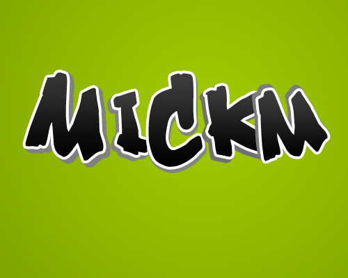
3D Text
The Text
Open up a new document and create a nice background. I used MickM-green which is really turning into a trademarked green. I love it. It's not even a real color, but more and more people start to use it.
Anyhow, just make sure your document is large enough. I used 500px x 400px.

Now, on a new layer, create some text. But instead of writing the entire word on one layer, place all different letters on different layers.
I started with the M of the word "MickM". Make sure your font is nice enough to work with. With nice I mean that font needs to be thick enough. Too thin fonts will look a bit weird. Also make sure they're all black.
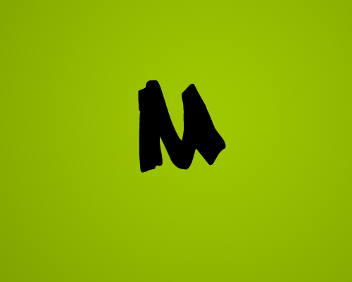
Because you're using different layers, you can always play with Ctrl+T to enlarge or scale the letters if needed. If you're done, you should have a few layers with every letter on another layer.
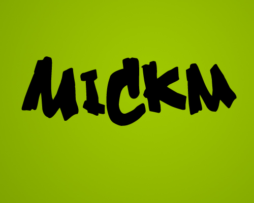
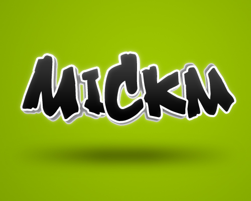
Making it look 3D
Now, on every letter add the same layer-style. What we're gonna do is add a white outer stroke that can deviate between 3px or 5px depending on the size of your font. Then add a gradient overlay and set this to SCREEN and lower the opacity of the overlay to 20%.
If you add this layer-style to one of the layers, and then right-click the layer and select "Copy Layer-Style", you can right-click every layer and choose "Paste Layer-Style". Or, if you have a lot of letters, select all layers and then paste it.
Now hide all but one layer to work on. Select your Move-Tool and while holding ALT press UP and LEFT one at a time. (LEFT, UP, LEFT, UP, LEFT, UP, etc) ...untill your letter looks like it's 3d.
Then select all the layers except the top-layer and merge them together by Ctrl+E.

Once merged, press Ctrl+U and drag the lower slider to the left a little to make the 3d-part of your letter a little darker to make it look like the lighting is giving it that extra touch.
When you're done, merge those 2 layers together as well!

Continue repeating this step but every time, use different angles. (Left, Left, Left, etc) or (Right, Bottom, Rightm, Bottom, etc). Anything goes. Also make sure that you merge all the seperate layers. So now you should have the amount of layers you had at the beginning again!
Now move the layers around, displace them, order them the way you like it and just make sure the letters are placed the way you like it.
Not much I can teach you about that! I chose to let my letters overlap each other a bit. As you can see the outer letters are in the back, then come the inner letters, and the middle letter is the closest letter if, let's say, the letters are placed on a table in front of you.
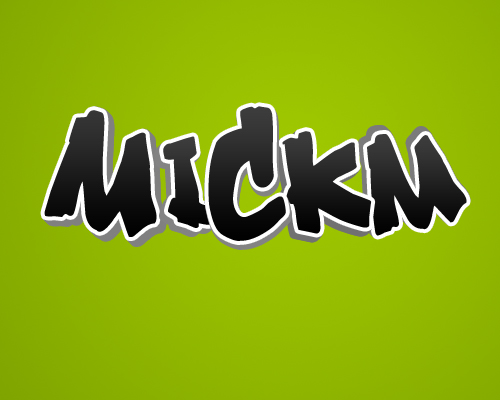
Now merge all those letters together! Then Ctrl+click on the thumbnail of the layer to select it and you'll notice you will get a selection around it.

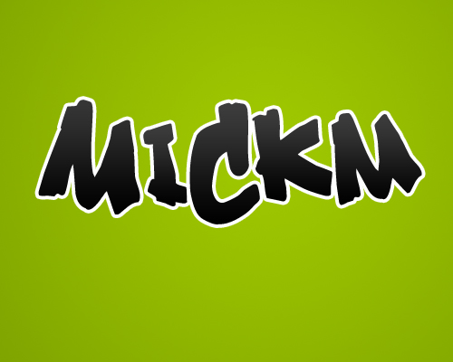
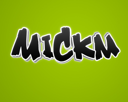
Cool 3D Text
Then add a very soft White>Transparent gradient to a new layer and lower the opacity of it to 2%-10%. Then add a very small and soft white inner glow to the entire name or word.


Now add a large, but very soft outer glow in white to the text. Set the blending-mode to Overlay and the opacity around 40%.
With a soft brush (45px) brush, on a new layer, while holding Shift a small straight line underneath the text. It should not cover the entire area underneath the text though.
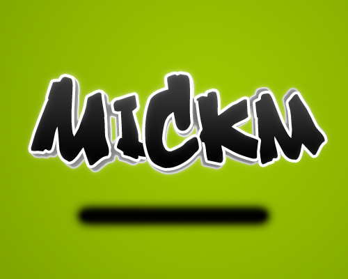
Go to Filter>Blur>Gaussian Blur and set it to 20-30. Then go to Filter>Blur>Motion Blur and set it to an amount so that the shadow covers the entire area underneath your text. Then just lower the opacity to 20-40.
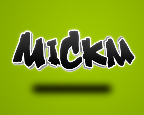

On a new layer above all of it, grab a small brush around 1px-3px and use a very bright and noticable color to draw small strokes on places where we want some shine. I used red, because it's a color I haven't used in the entire image, so easy noticable.
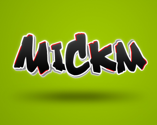
Press Ctrl+U and drag the lower slider all the way to the right to make the lines all white. Now go to Filter>Blur>Gaussian Blur and leave the settings or play around with them if you want more or less shine.
I chose to leave them as they were!

Conclusion
Now you are done with the new and improved 3d-text tutorial. Not only did you learn how to make text look 3d, you now also know how to do cool stuff with it.
You can use this technique any way you want. You can also choose to make all the angles of the letters look the same way to make them all look the same, but if you want a more playfull composition like this one, you can add some difference to make it look cooler!
Designing with 3D Render Pack
Preparations:
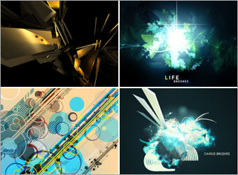
Download Render Pack 4 here.
Download Life Brushes here.
Download Darius Brushes here.
Download Vector Linedots here.
Download 10 Scan Lines here.
Download Krakograff Textures here.
All rights of these resources belong to their respective owners.
Step 1 - Setting Up Background:
Create a document of size 750x550 pixels.
Choose a Krako's Texture 6 and resize it to fit into the working area.
Step 2a - Adding Base Colors:
Create a new layer and name it as Base Color 1.
Set your foreground color to #8A0504. Using a Soft Brush tool with size 400, paint a huge dot on the right of the document.
Set the Blend Mode of this layer to Overlay.
Step 2b - Adding Base Colors:
Create another layer and name it as Base Color 2.
Set your foreground color to #F38F00 and repeat what you have done in Step 2a.
Set the Blend Mode of this layer to Overlay.
Step 3a - Adding 3D Render:
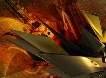
Open up omjpack4r2.png of the Render Pack downloaded earlier.
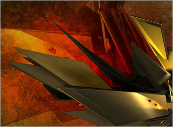
Drag the shape into the document and position it the way seen in the diagram.
Set the Blend Mode of this layer to Soft Light.
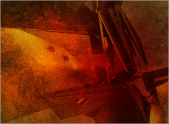
Step 3b - Adding 3D Render:
Drag the same shape into the document again.
Reduce the size and move it to the bottom right so it looks like those 'blades' are emerging from there.
Step 4a - Abstract Details:
Load the 2 brushes, Darius and Life.
Create a new layer below the 3D render and name it as Black Shapes.
Set the foreground color to #000000. Select any the brushes in these 2 sets and paint them in any place you want it. Set the Blend Mode of this layer to Overlay once you are done.
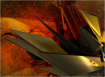
Step 4b - Abstract Details:
Create a new layer above Black Shapes and call it as White Shapes.
Set the foreground color to #FFFFFF and repeat Step 4a with other brushes. Set the Blend Mode of this layer to Soft Light once you are done.
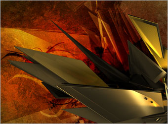
Step 4c - Abstract Details:
Load Vector Linedots brush.
Create a new layer above Black and White Shapes layer. Repeat similar methods done in Step 4a and 4b.
Step 4d - Abstract Details:
Load 10 Scan Lines brush.
Create a new layer below the lines and dots. Select Scaners7 and paint it with #FFFFFF.
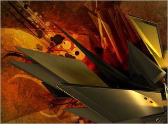
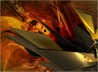
Step 5 - Adding Bitmap Texts:
Type in some texts with small sizes, around 6-8 points to complete the design. They can be of any colors as long as it fits the overall scheme.
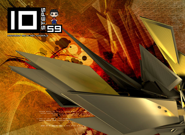
Optional:
There you have it!
As I prefer the whole thing to be lighter and of less contrast, I created a Levels Adjustment Layer above everything with values, 3, 1.56, 255 to brighten the art a little.
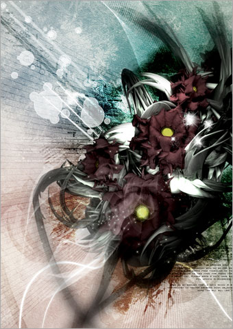
My Deviation:
With the same methods, I decide to try out another design with selections of much lighter colors.
The basic techniques used are exactly the same as those mentioned above.
Hope you will find this tutorial useful.
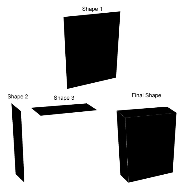
Great Looking 3D Box
Step 1
Create a new document and start by drawing a 3d box like the picture below and you should end up with the final image.. Dont worry about gaps as this adds to the effect later on.
Step 2
Click here to download a textured image and drag it on to this and press Ctrl and T and then scale it down and press right click on the mouse and goto Distort and distort it to the image as shown below.
Step 3
Now grab the brush tool and set the forground colour as 341203, now create a new layor and draw where the white lines you have missed are like the picture below.
Now put that layer to the bottom so you get a nice effect.
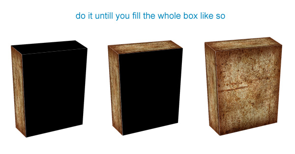
Step 4
Keeping with the brush create a new layer making sure that the new layer is above everthing. Now set the brush opacity to only 20% and keeping with the same brown colour start to draw shadows on the edges of the box untill you have a showing effect like the picture below.
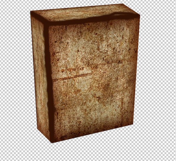
Step 5
Click here to download the background. Now drag it to thedocument which will automatically give you a new layer. Making sure its the top layer, make the opacity to 50% and press P which is the Pen Tool and draw round the box and making sure you draw round a few grass petals so you can get the effect that its lying in grass. Now press the right click on the mouse and click Make Selection and click ok. Once you have done that just press delete on the keypad. You should have an image like the one below.
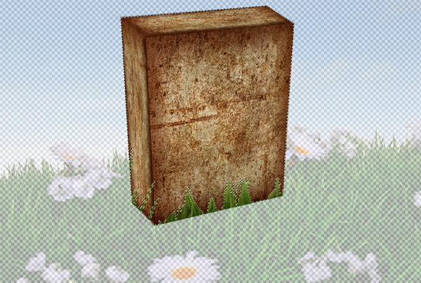
Now bring the opacity to 100% again and you should have something like the image below.
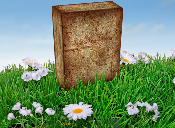
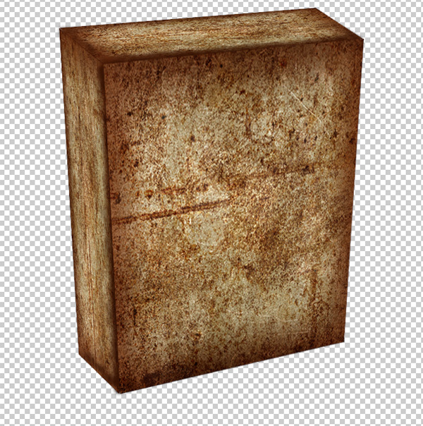
Step 6
On the layer you just did Ctrl and click the image in the layer image and the create a new layer. Grab the gradient tool and set the forground colour to 070636 and making sure that it is set the background colour to transparent which is at the top of the screen. drag from top left corner to near the box, then from other corner to box and a few from the middle top to box untill you have the look as below.
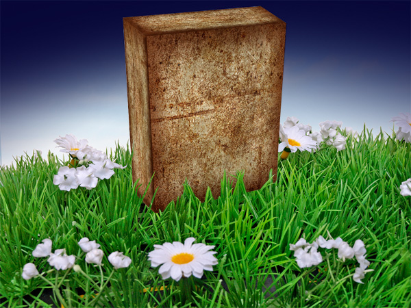
Final Step
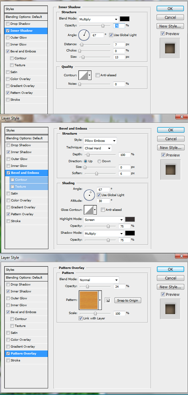
Ok create a new layer and write some text within the box. Use the layer setting below and you have then finished.
This is how it looks.

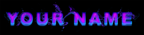
3D Text with Special Smoke
1. Let's start out by creating a new file. We will be creating a 3D text effect with special smoke. I used a 800x300 pixels canvas set at 72dpi, and I filled my background with a black color. Then make a new layer set and name it 'text design'.
2. Now select the horizontal type tool then set the font family to arial black, regular, 80 pt, smooth and white color. In a new text layer type your name.

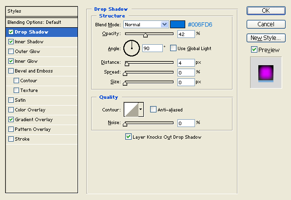
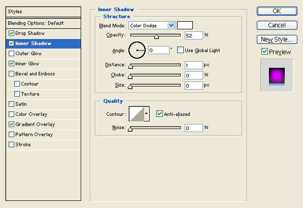
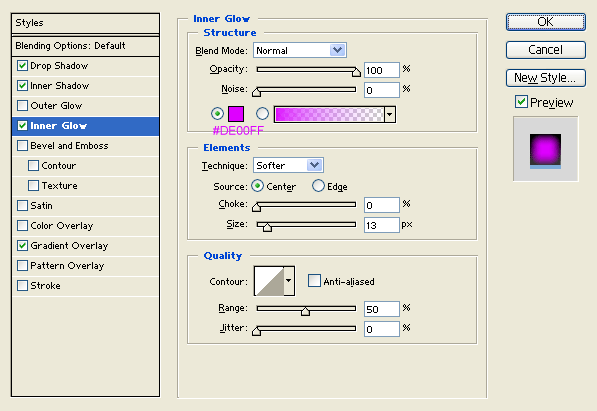
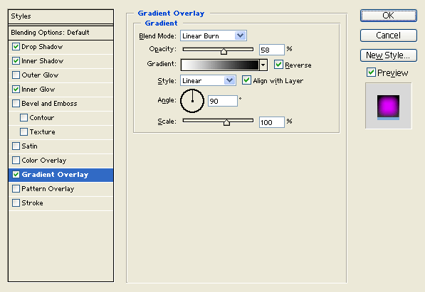
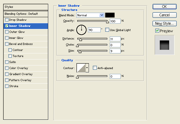
3. Under layer style (layer - layer style) add a drop shadow, inner shadow, inner glow and gradient overlay blending options to your name text layer.
Result:

4. In a new text layer type your name with white color right on the first name. Then nudge it up by 3 pixels.

5. Under layer style (layer - layer style) add a drop shadow and inner shadow blending options to your white colored text layer. Then set the layer's blending mode to Darken at 68 % opacity level.

Result:

6. Duplicate your 'text design' layer set then go to (layer - merge layer set), the layer set should turn into a regular layer. Now place the second text design behind the 'text design' layer set on the layers window and nudge it down to create a 3D effect.

7. Under layer style (layer - layer style) add an inner shadow blending option to the second text design layer.
Result:

8. Now for the special smoke, first add a marquee selection around your name. Then go to (edit - copy merged) and paste.

9. Now go to (filter - distort - wave) and apply the settings below to your name design layer from step 7. If you don't like the result with the settings provided you can keep on applying the same filter until you get the same results.
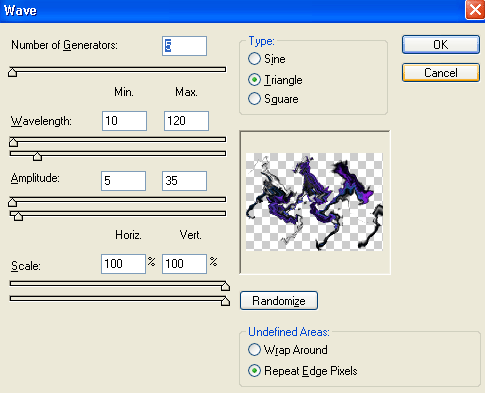
Result:
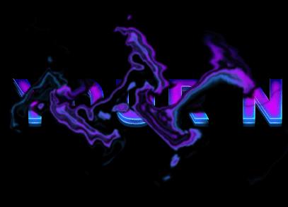
10. Once you have a smoke design that your satisfied with you can go ahead and scale it down so its the same size as your text. Then finish it off with more smoke design on the rest of your name.
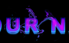
And there you go, this was a long tutorial but it's finally finished! A new 3D Text effect with special smoke has been created, have fun with it!